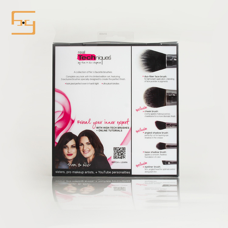
1) Care of color and packaging
As a color and packaging affiliation, the color of the outer package can be used to display or reflect the inner package. To allow people to see the outer package, you can basically feel or think of the inner package. For this issue, if we can walk into the store to observe the goods, many products cannot reflect this relationship. Consumers cannot think of what the packaged goods are. Of course, there is no positive sales promotion for product sales. The color of ordinary packaging should have different degrees of characteristics.
In the industry, food packaging usually describes the warmth and intimacy with the primary colors of pale yellow and pink. Of course, including tea, green beverages, green and blue, alcohol, pastries and big red, with optimistic children's foods, daily cosmetics and normal coloring roses, the main colors are light green, light blue, dark brown, mostly stressed Warm and elegant, clothing and footwear are more dark green, dark blue, brown or gray, in order to highlight the calm and elegant beauty.
(2) Contrast between color and color
The contrast between color and color is one of the most obvious and elusive things in many packaging designs. In packaging design, this comparison is very obvious and common. These so-called contrasts, the general comparison of the following aspects: the use of shades of color contrast, the use of light weight contrast, the use of the color of the shop to face ratio, the use of simple and colorful color contrast.


