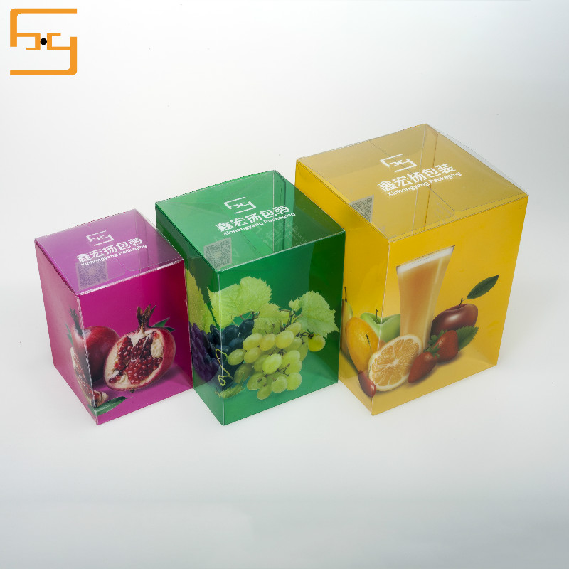
The color of the product's plastic box packaging design should be noted from the following points: First, the color and the care of the packaging; Second, the contrast between color and color itself. These two points are the key to the use of color.

(A) The care of color and packaging
Then, where do we talk about the relationship between color and packaging? It is mainly through the external packaging colors that we can reveal or reflect the inner packaging items. It allows people to basically perceive or think of what the inner package is. For this question, I have mentioned it many times in the past articles, but if we can come to the store to get a look at the goods, many of the goods did not reflect this relationship. So that consumers can not think of what to pack things from the table and inside. Of course, there is no positive sales promotion for the sales of products. The normal external packaging color should grasp this same characteristic to varying degrees;
From the industry, food plastic box packaging, PVC plastic box, PET plastic box, PP plastic box, matte plastic box packaging of the normal use of the main colors of the yellow, pink to express such a warm and close feeling. Of course, many teas are green, beverages are green and blue, liquors and pastries are made of big red, children's foods are made of rose, and daily cosmetics are normally used. The main colors are mostly rose, pink, light green, light blue, dark brown, to highlight the warm and elegant feeling, clothing and shoes and hats are mostly dark green, dark blue, brown or gray, to highlight the calm Heavy and elegant beauty.
(B) The contrast between color and color
Besides, the contrast between color and color. This is the easiest thing to do in many commodity packaging designs but it is very difficult to grasp. In the design from the master, the wound effect of the package is snow white, otherwise, is the lower Riba. In Chinese calligraphy and painting, such a saying is often popular. It is airtight and sparse. What is actually said is a comparative relationship. In the packaging design, this contrast is very obvious and very common. These so-called comparisons generally have the following contrasts: the contrast between the use of colors, the contrast of the use of colors, the point-to-point ratio of color use, the contrast between the use of colors, the contrast between the use of color and the contrast of color, and the contrast of color. Contrast and so on.
Just because the color has special meaning for the plastic box packaging design of the product, we need to pay attention to the choice of color in the outer packaging of the design product. If it is slightly careless, the effect of the product packaging may be very different. No, good designers must have their own unique understanding and application in color.

